The Hitchhiker's Guide to Information Visualization in NLP Papers
Diagrams and graphics are efficient forms to convey information in scientific communication and storytelling. These visuals could provide intuitive evidence of findings and concise conceptual connections in a highly readable paper. Knowing how to use these visualisation techniques and effectively fuse multimodal information in academic writing is a craft. Books on data and information visualization usually fall into two categories: one focuses on general graphic design and selection of visual forms; the other one is about detailed code to implement with python or R libraries. However, when it comes to the specific field of academic writing, there is a lack of case studies on how the visual design thinking should be integrated with the academic text to tell a coherent story. In recent years, the explosion of AI papers has produced many excellent visualisation examples. However, these visualisation techniques exists in a fragmented manner, and are not summarized in a systematic way. In this blogpost, I will summarize my observations and notes, and highlights how visual forms express meaning and serve the information structure of NLP papers. I hope to present a more coherent view and provide some transferable experiences.
1. Visual Information Blocks: Classification and Distribution
1.1 Visualizing Numbers
- Descriptive statistics of dataset or benchmark: graphics of this kind are usually in Section Data, Appendix;
- Analysis of experimental results: graphics of analysis appear in Section Results/Analysis, Appendix;
Many books on data visualization cover visualizing numbers very well, including how to match data types and visual forms, and their implementations. I won’t go into the details here.
1.2 Visualizing Concepts
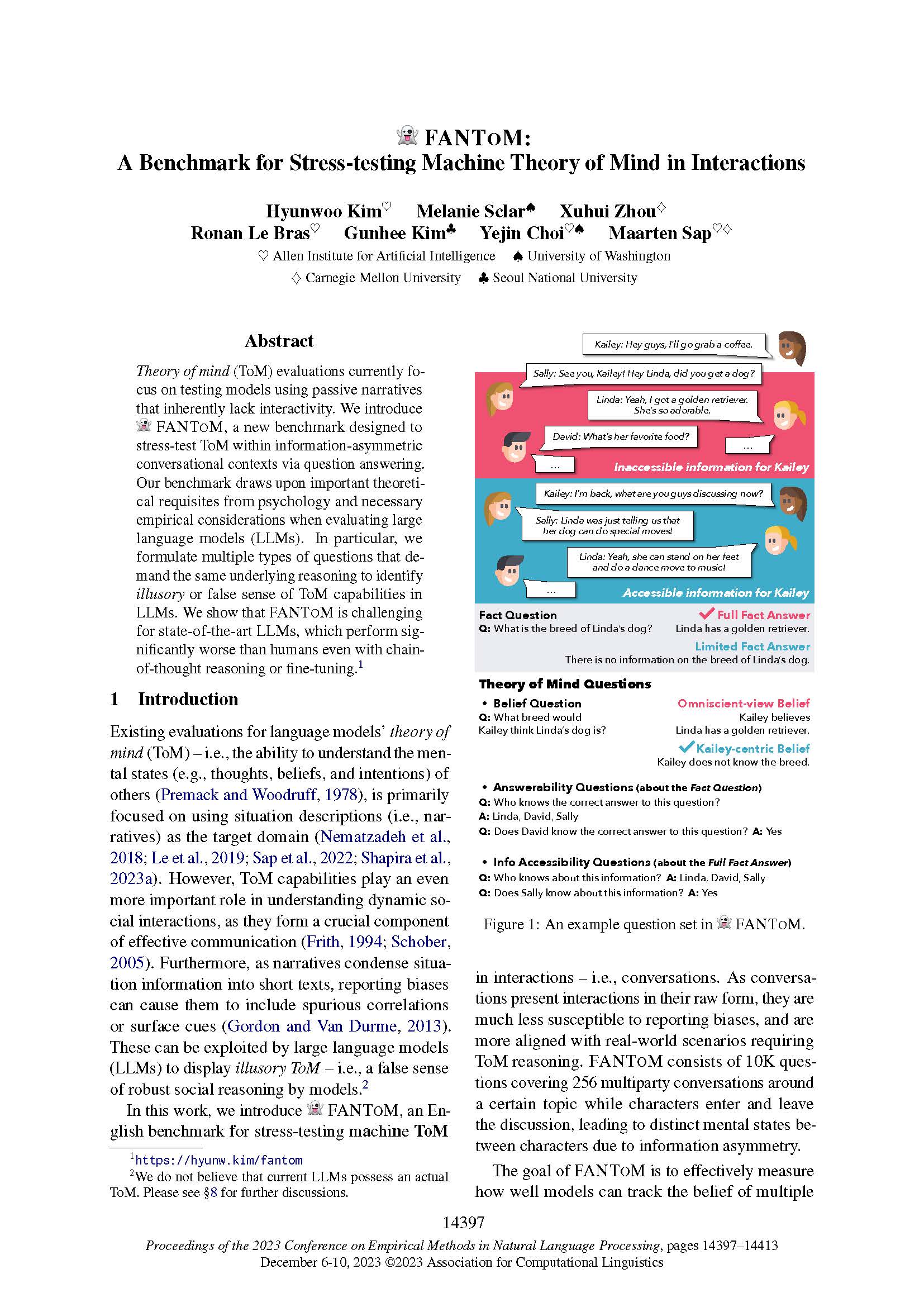
1.2.1 Task demonstration / topic illustration
Graphics of task demonstration and topic illustration are in Section Introduction. Depending on the size of the image and the style of conference template, the image is usually set in the top right corner of the first page or at the top of the second page.


Getting the reader to catch the point in the first few minutes is especially critical, given that the peer-review in the real world is not ideal. This forward position serves to improve the readability, and help the reader quickly grasp the focus and contributions of the paper.
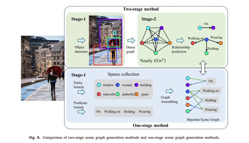
1.2.2 Model architecture
Graphics of model architecture are usually in Section Model or Experiment. Modular design and reuse bring efficient delivery. The same goes for drawing model architectures. Professional UI and graphic designers would develop their own component libraries. Consider developing a personal component library of icons and elements if your papers frequently need illustrations of model architectures. ML Visuals could be a good start point.

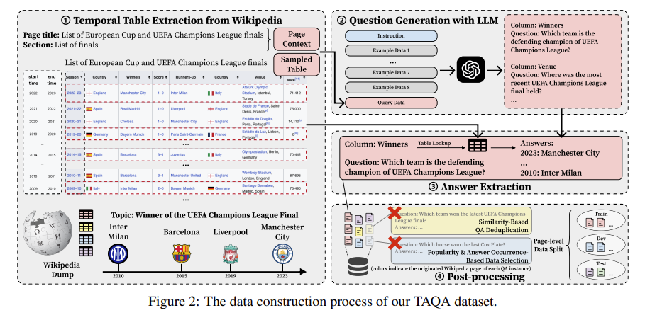
1.2.3 Process
Graphics of process are usually in Section Experiment and Data/Appendix. Using infographics to illustrate process could free reviewers from long and boring descriptions of experimental setups or data annotation pipelines, and making it easier to engage with your work.


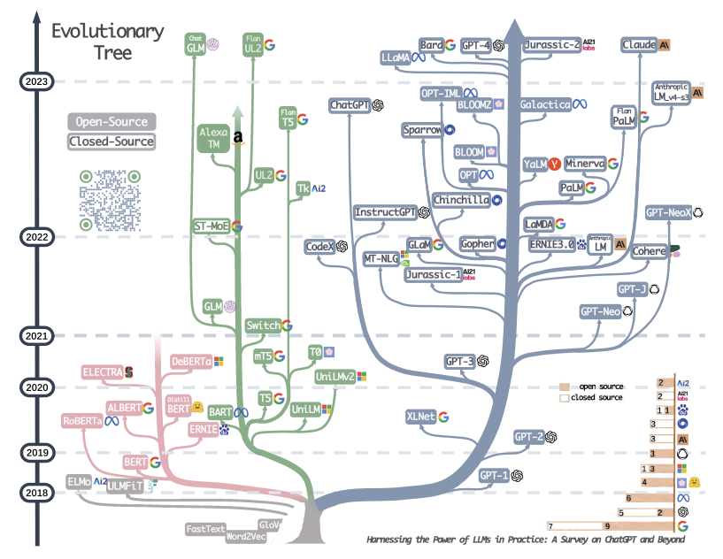
1.2.4 When, where and who
Graphics of when, where and who are usually in survey papers and Section Related Work. This type of infographic provides a quick overview.
